
Let's start with a classic. This ad came out in a time when advetising was getting to be way over the top gaudy illustrations and colors all design to shock and wow. The Volkswagon ads rely on the design of the vehicle only. The layout is very straight forward and simple. Exactly what the volkswagon was to that generation. Designers to this day use this form to set apart well designed items (i.e the eames chair.)

This ad works very well. It uses the same simplicity as the volkswagon ad but it takes it to another level. The simple graphic shapes, legs, and a hand, a somewhat boring by themselves. When combined in this way they create a very visually powerful poster. It is not shocking but it moves you to want to help.

The last ad is meant to shock and scare the viewer. It was created for a French aids awareness campaign. The concept was to make people thin about who they are sleeping with. I think that it works extremely well. All three posters get their point across with little or no words. This is key to a good visual piece.

This is a particularly horrible ad that I found on the side of a web page. It is trying to sell anti wrinkle cream and it's not working very well. Before and after pictures don't work, our photoshop culture doesn't buy it anymore. Second the two images side by side don't create a nice picture when they are put together. It looks like a hideous monster. The text and image do not go together whatsoever and the product at the bottom seems slapped on. It's all bad.

This has an arbitrary blue background and 4 different typefaces. A typographic no-no unless done correctly. I don't know what this is for unless I read the text and its in a bad font that is almost impossible to read. I can barely even look at this. Unfortunately the bad advertising is so much easier to find. You have to dig for the good stuff.

I can't even believe that they got away with this. I don't think there is a CEO on the planet that would pay thousands of dollars to create a billboard saying how ugly their product is. The rest of the ad is fine, I just question why it was made at all.
 Let's start with a classic. This ad came out in a time when advetising was getting to be way over the top gaudy illustrations and colors all design to shock and wow. The Volkswagon ads rely on the design of the vehicle only. The layout is very straight forward and simple. Exactly what the volkswagon was to that generation. Designers to this day use this form to set apart well designed items (i.e the eames chair.)
 This ad works very well. It uses the same simplicity as the volkswagon ad but it takes it to another level. The simple graphic shapes, legs, and a hand, a somewhat boring by themselves. When combined in this way they create a very visually powerful poster. It is not shocking but it moves you to want to help.
 The last ad is meant to shock and scare the viewer. It was created for a French aids awareness campaign. The concept was to make people thin about who they are sleeping with. I think that it works extremely well. All three posters get their point across with little or no words. This is key to a good visual piece.
 This is a particularly horrible ad that I found on the side of a web page. It is trying to sell anti wrinkle cream and it's not working very well. Before and after pictures don't work, our photoshop culture doesn't buy it anymore. Second the two images side by side don't create a nice picture when they are put together. It looks like a hideous monster. The text and image do not go together whatsoever and the product at the bottom seems slapped on. It's all bad.
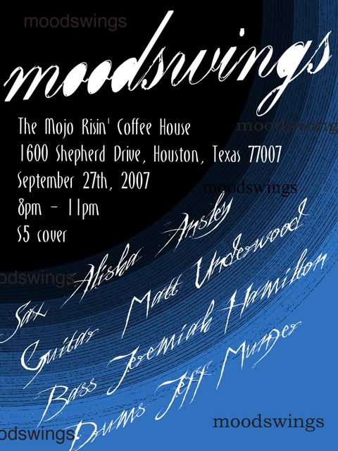 This has an arbitrary blue background and 4 different typefaces. A typographic no-no unless done correctly. I don't know what this is for unless I read the text and its in a bad font that is almost impossible to read. I can barely even look at this. Unfortunately the bad advertising is so much easier to find. You have to dig for the good stuff.
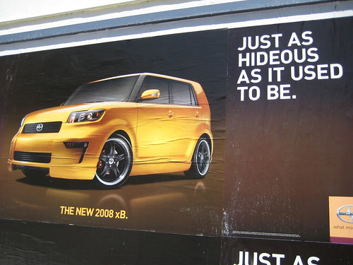 I can't even believe that they got away with this. I don't think there is a CEO on the planet that would pay thousands of dollars to create a billboard saying how ugly their product is. The rest of the ad is fine, I just question why it was made at all.

No comments:
Post a Comment